Thursday, 28 November 2013
Sunday, 24 November 2013
Taglines Research
For our trailer we need to include taglines in the graphics in-between shots in our trailer to recreate the romance trailer conventions and also highlight the narrative of our film. For planning purposes we used the line 'When can you tell if love is a dream, or a nightmare' but agreed this would not work and didnt really capture our narrative. We looked at other trailers for inspiration:
Revolutionary Road:
'How do you break free / without breaking apart'
Remember Me:
'He had lost his way / until the moment / he let someone in'
One Day:
'...comes an extraordinary story / of friendship and loss / and the enduring power of love'
The Vow:
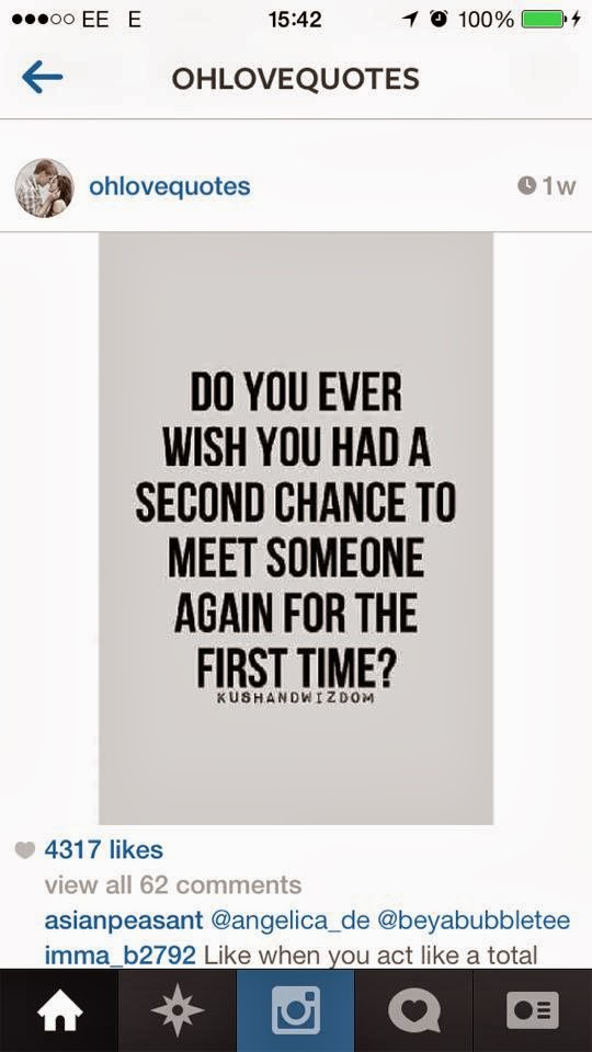
'Can a once in a life time love / find a second chance?'
Celeste and Jesse Forever:
'Sometimes the end / is just the beginning'
Nick and Norah's Infinite Playlist:
'When plans get changed / the possibilities are infinite'
We also looked at Instagram pages which are dedicated to love quotes similar to those in films:


Influencial Song Lyrics:
'And I see losing love is like a window in your heart. Everybody sees you're blown apart, everybody feels the wind blow.' 'Graceland', Paul Simon
'And I need you more than want you. And I want you for all time' 'Wichita Lineman', Glen Campbell
'I never dreamed I'd love somebody like you, I never dreamed I'd lose somebody like you' 'Wicked Game' Chris Isaak
'She's got me with nothing to win and nothing left to lose' 'With or Without You', U2
W.H.
Revolutionary Road:
'How do you break free / without breaking apart'
Remember Me:
'He had lost his way / until the moment / he let someone in'
One Day:
'...comes an extraordinary story / of friendship and loss / and the enduring power of love'
The Vow:
'Can a once in a life time love / find a second chance?'
Celeste and Jesse Forever:
'Sometimes the end / is just the beginning'
Nick and Norah's Infinite Playlist:
'When plans get changed / the possibilities are infinite'
We also looked at Instagram pages which are dedicated to love quotes similar to those in films:


Influencial Song Lyrics:
'And I see losing love is like a window in your heart. Everybody sees you're blown apart, everybody feels the wind blow.' 'Graceland', Paul Simon
'And I need you more than want you. And I want you for all time' 'Wichita Lineman', Glen Campbell
'I never dreamed I'd love somebody like you, I never dreamed I'd lose somebody like you' 'Wicked Game' Chris Isaak
'She's got me with nothing to win and nothing left to lose' 'With or Without You', U2
W.H.
Storyboard Animatic
This was a final animatic of our storyboard - this will help us to have a clear structure in our minds when filming and editing the real footage later. We put 'She's Always A Woman To Me' in the background by Fyffe Dangerfield to have an idea of how our style of music will work with it. We also added a couple of sound effects to it.
B.M. W.H.
Wednesday, 20 November 2013
Graphics Planning - Background and Movement Influences
Although many trailers like 'Revolutionary Road' and 'Blue Valentine' use basic text on black background for the credits, we thought that it would be a lot better to follow other trailers with more inventive backgrounds on the credits. We thought this was much better as it helps set the scene and mood and also would look a lot more professional to use a slightly moving background, and will look work better to create more colour. However, we still want to retain a level of simplicity so we don't want to use distracting font.
In 'The Lucky One', they use a faded and quite basic background for the credits, but also include a bright exposure in the movement of the title.


I really like the use of light in these credits as it is a lot more interesting than a simple title on the background. We would like to incorporate a light change in our credits though possibly something more subtle and elegant like in 'Like Crazy':


For the credits, the graphics fade in and out from the scene. They also play around with light with the glitter and put gradients across the font, which is very subtle but works well in making it look professional and classy. This also happens in the titles:


In the trailer for 'Dear John', the background does not actually move or reflect light (though fades in and out), but the actual credits do, drawing more attention to them.


Through looking at these examples of credits, I have understood that simple font is still necessary in terms of conforming to the conventions of a romantic genre trailer, however there are ways to develop the graphics to make it look more interesting than that of 'Revolutionary Road' and 'Blue Valentine.' Evidently colour is extremely important in terms of symbolism for each film - 'The Lucky One' tries to replicate the desert as Logan is fighting in Iraq, whilst 'Dear John' uses blue as an echo of the sea which is where John and Savannah spend a lot of their time. I really like the credits for 'Like Crazy' as it is softer and more romantic trying to recreate a feeling of fairy lights. This would also be perfect for our film as we want to create this same comfortable, homelike romance and we will be filming a lot of fairy lights when we film at Christmas in the Laines in Brighton. To come up with similar graphics, we will be using Final Cut Motion for our credits.
W.H.
Monday, 18 November 2013
Graphics Planning - Font Influences
From looking at other trailers and posters for all types of films, the same font and colour scheme is generally used throughout all marketing campaign and is also the same for the title. For example 'Drive':


In the romantic trailers that I have studied, the majority of the font is very simple with basic colours, completely different to that of 'Drive.' The text in the trailer, for example showcasing the stars of the film, is usually the same font as the title which is used on all the posters. An example of this is the font used for Revolutionary Road, as this is very basic and simple, yet is used throughout all the marketing schemes.


POSTER DVD COVER


In 'Like Crazy', they also use the same font throughout all the marketing schemes, and it is similarly very basic. However, they have changed the colour scheme without the font.


SOUNDTRACK COVER:


In the romantic trailers that I have studied, the majority of the font is very simple with basic colours, completely different to that of 'Drive.' The text in the trailer, for example showcasing the stars of the film, is usually the same font as the title which is used on all the posters. An example of this is the font used for Revolutionary Road, as this is very basic and simple, yet is used throughout all the marketing schemes.

POSTER DVD COVER


TRAILER CREDITS


POSTER DVD COVER


TRAILER CREDITS
In 'Blue Valentine', there is no clear continuity in the font used. In the trailer, there are two types of basic font, the title emphasised in bold and chunky font.

However, they released a number of different styles for the poster with different fonts, photos and colours. In the end, the font for the main poster was completely different to that of the trailer. Originally the posters featured the same font, or something very similar:


The final and most famous design was the following poster, which used completely different colours and font. This was the design used also on the DVD cover and the soundtrack cover.
POSTER:

DVD COVER:

SOUNDTRACK COVER:

Through the trailer I have researched, it seems more common to have the same style of font for the trailer and all the posters as it clearly links everything together. In our project we will be doing this, however, I like the font that they used in the final poster for Blue Valentine as I thought it was slightly more inventive than the standard font used in both Revolutionary Road and Like Crazy. I also liked the change in font for the title from the standard credits in the trailer as I think it made it stand out. However, if we choose to replicate this, we will only make simple changes, for example emboldening the standard font.
W.H.
Sunday, 17 November 2013
Sound and Lighting
For the soundtrack of
our trailer, we are searching for a piece of music which is melancholy and
docile. We will use a single track throughout the whole trailer, rather than a
number of varying tracks which is used in most rom-com trailers. In the trailers
we have looked at such as blue valentine and Revolutionary Road, there is a
single song used as the backing song, and the way the mood is changed is that
the volume is varied or the beat gets faster and softer, building tension.
We are asking our friend Charles Stooke to write a song which is
similar to these songs to use as the backing soundtrack to our trailer. We will
write our own lyrics to roughly fit the narrative of the story, and instead of
using multiple different tracks in our trailer like many other genres of
trailer do, we are going to stick to using one song right the way through,
because that is what the usual song is like in romance trailers. We will change
the mood of the trailer from happy to sad using alternating speed in the song
and during the happy montage we will most likely have the chorus, whereas
during the sad montage, we will use the sad and melancholy sounding verse.
We will have our trailer lit at the start in a warm dim
lighting, as the couple will be at a bus stop in the evening so it will be dark
naturally, however we will have to use some artificial lighting to stop the
film from becoming pixilated and bad quality, but we do not want to over do it
and make the shot look unnatural or unrealistic. We also want to set the mood
at the beginning to be happy.
To make the mood seem uplifting and show that there is love in
the air during the first montage and half of the trailer, we will generally use
brighter lighting and dress Grace and Isaac in brighter coloured clothes to
reflect their mood. An example of a trailer where they use this technique is
'Revolutionary Road'. The first half of the trailer is bright and sunny and the
couple are very much in love, interested in each other, and seem to be happy.
This can also be seen in 'Blue Valentine', when the opening few shots are
noticeably lighter and more happy than the second half.
We will use artificial lights when filming inside to make the
film clearer and better quality, and hopefully more professional looking. We
will also use accordant lighting to show the mood, for example, we will use
dull, glowing, warm, yellowy lighting to show intimacy, for example in shots
where Grace and Isaac are inside their flat during happy moments.

'Blue Valentine' early
shot

'Blue Valentine' later shot

'Revolutionary Road'
early shot
'Revolutionary Road'
later shot
B.M.
Subscribe to:
Posts (Atom)